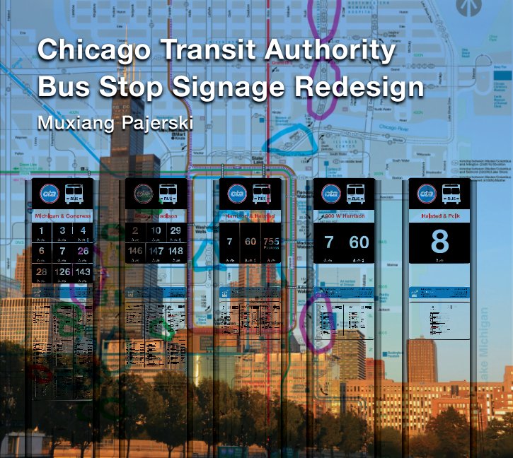
Chicago Transit Authority Bus Stop Signage Redesign
As a CTA bus passenger, I discovered that the current CTA bus stop signage wasn't informative. In my re-design, I intended to improve the signage in many different aspects including type, icons, color, shape, size of sign, and overall composition to create a visually and verbally more informative design that suits
Chicago's characteristics as one of the international tourist and cultural destinations.
From research, conceptualization, execution to art direction, I did it all independently.
In the end, I published a process book of this project and I presented my project at a Research Forum where over 300 people presented scholarly researches in different industries. My design received so much attention and positive feedback from the design and business communities that I was highly encouraged and recommended to apply for a patent for my design.
In the process of designing and presenting my design and publishing my process book, I applied my knowledge of photography, typography, graphic design, photo manipulation and correction, illustration and English writing and public speaking.
Chicago Transit Authority Bus Stop Signage Redesign
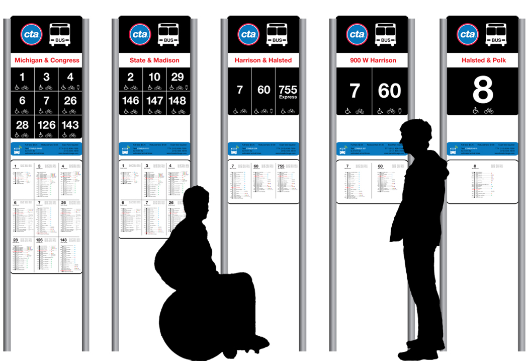
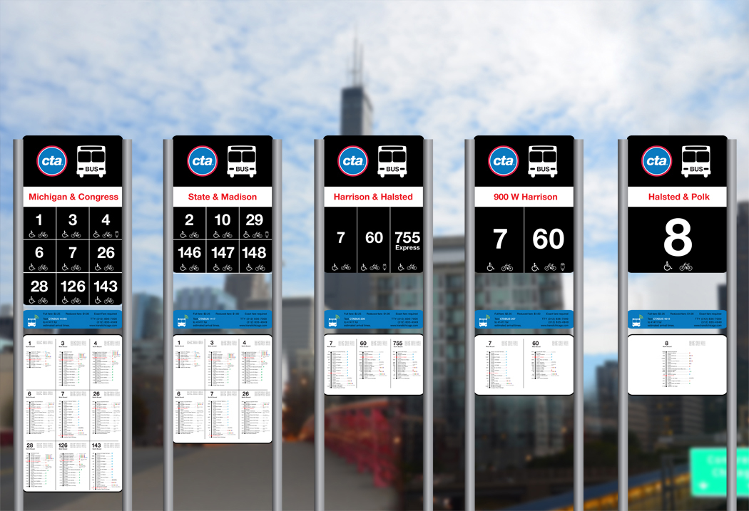
System and Scale
Chicago Transit Authority Bus Stop Signage Redesign
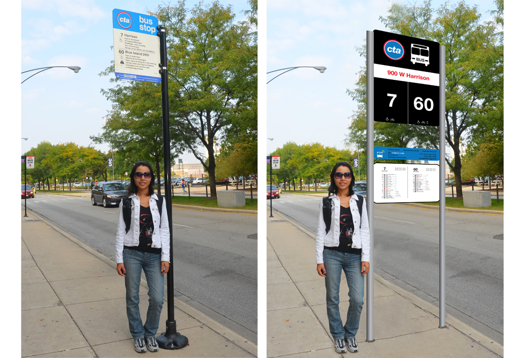
Before and After.
Chicago Transit Authority Bus Stop Signage Redesign
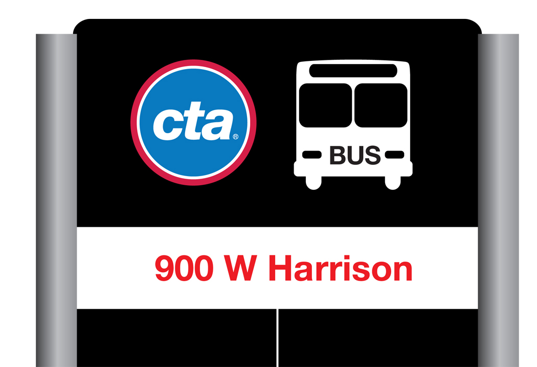
Detail.
Chicago Transit Authority Bus Stop Signage Redesign
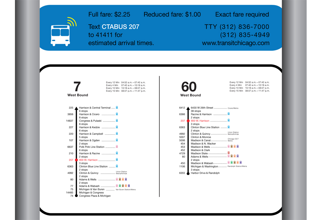
Detail.
Chicago Transit Authority Bus Stop Signage Redesign
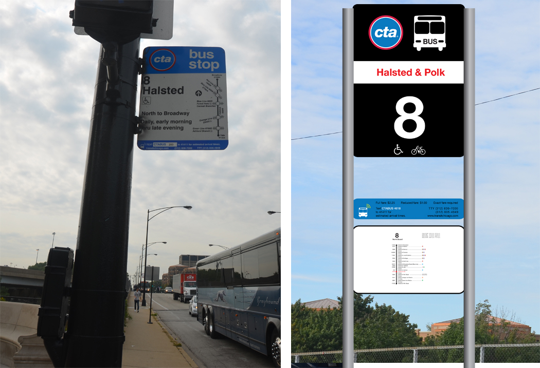
Before and After.Click here to preview my process book.
Chicago Transit Authority Bus Stop Signage Redesign
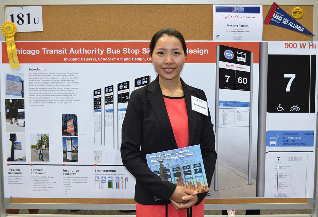
Presentation at UIC Research Forum.